GUIDE LINES:
In order to obtain correct and uniform height of letters and numerals in lettering and numbering, guide lines are drawn. Vertical letters do not look pleasant if all the letters are not uniformly vertical and inclined letters do not look good if all the letters are not uniformly inclined. Therefore, in addition to horizontal guide lines, light vertical or inclined guidelines should be used. Vertical guide lines are not used to space the letters instead, to assist in maintaining a uniform uprightness or uniform inclination of letters.
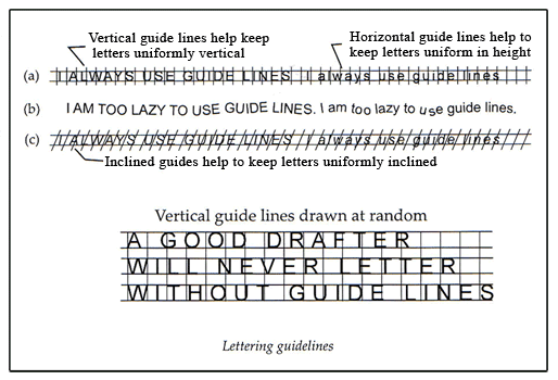
Guide lines for finished pencil lettering should be drawn very lightly such that they need not be erased, as it is not possible to do so. after the lettering has been completed. A very hard pencil should be used to draw them. Whereas on inked drawings the guide lines can be erased, after the ink is dry.
In the case of capital letters two horizontal lines and in the case of lowercase letters four horizontal lines are drawn such that distance between the inner two lines is 2.5 times the distance between any two consecutive outer lines. Vertical and slant guide lines are of great help, for beginners to maintain the proper direction of vertical or inclined stems of letters.
SINGLE STROKE VERTICAL LETTERS:
An alphabet of vertical capital letters is shown in figure.
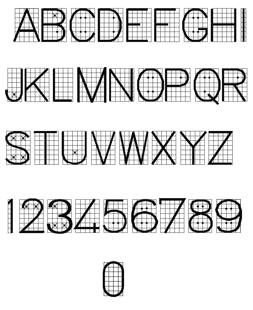
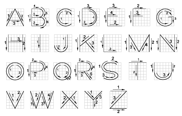
The direction of movement of the pencil point to make the letter and different strokes to be executed are natural and do not require memorizing, but the beginner must keep in mind that it is a decided mistake to practice lettering before he/she knows the proportion and order of strokes of the letter he/she is to execute.
Single stroke vertical letters may be further classified as:
- Straight line letters
- Curved line letters
STRAIGHT LINE LETTERS:
ILT: The I and the vertical strokes of the L and T are drawn downward with a finger movement. The horizontal strokes are drawn from left to right. The normal width of the L is 4.5 units but when it is followed in a word by a capital letter A its width should be reduced to about 4 spaces to compensate for the large area between the letters.
FEH: Stroke 4 of the E is nearly three-fifths as long as stroke , and is slightly above the midpoint. Stroke 3 of the F is the same as stroke 4 of the E. Stroke 2 of the H is again slightly above the centre of its height.
AVW: Stroke 3 of the A is at one-third the height of the letter from the base line. The W is 1.33 times the normal width of a letter and it is the widest letter in the alphabet.
MNZ: There is a decided advantage in drawing the parallel strokes of the M and N before drawing the diagonal strokes. Stroke 3 and 4 of the M, and stroke 2 of the N should intersect at the base line. As per SP; 46-1988 the stroke 3 and 4 oaf M intersect nearly two units above the base line.
KXY: Stroke 1 and 2 of the K intersect at a point one-third the height of the letter from the base line. Stroke 3, extended, intersects stroke 1 at the top. The three strokes of the Y intersect a little below mid-point. The strokes 1 and 2 of the X intersect slightly above the centre.
CURVED LINE LETTERS:
OCQG: The letters O, C, Q and G are formed with circles as bases. The O and Q are complete circles. The C and G are not complete circles and, therefore, their width is slightly less than their height. Stroke 3 of Q is a radial line making an angle of 30° with a vertical. The horizontal stroke 5 of the G begins at the centre of the circle and stroke 4 is vertical.
JUD: The J is a modification of U but is one-half spaces less in width. Stroke 3 of the U is slightly elliptic and begins at a point one-third the height of the letter above the base line. The right side of D is circular.
PRB: Stroke 4 of the P is slightly below the centre of height of the letter, while stroke 4 of the R should be at mid-point and stroke 3 of the B is slightly above mid-height.
S: The upper and lower portions of the S are elliptic , the ellipses being tangent to a common vertical line on the left side.
SINGLE STROKE INCLINED CAPITAL LETTERING:

The order and directions of the strokes and also the proportions of all the slant letters are exactly the same as those for vertical letters. Inclined letters can be regarded as oblique projections of vertical letters. Inclined guide lines, made independently of the widths of the letters and space will aid in getting a correct and uniform slant of inclined letters. The inclination is usually kept 75°. The inclined direction lines should be drawn with a special lettering triangle of 75°. Essential requirements of this lettering are:
- Keeping to a uniform slope.
- Having the letters full and well shaped.
- Keeping them close together.
SINGLE STROKE LOWERCASE LETTERS:
These letters may be written in four guide lines. The body portion of letters is 2/3 to 5/7 of the height of related capitals. The ascenders extend to the cap line and descenders to the drop line.
Single stroke lowercase letters may be further classified as:
- Vertical lowercase letters
- Inclined lowercase letters
VERTICAL LOWERCASE LETTERS:
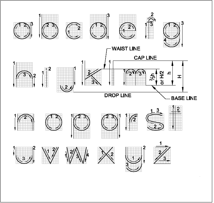
The i, l, k and t. All letters of this group are formed by straight lines.
The o, s, v, w, x and z. All letters of this group are similar to the capitals.
The a, b, d, p and q. The bodies of the letters in this group are formed by letter o and they differ only in the position and length of the stem stroke.
The letter g, is related to the letters o and y. Letter c is modified o and e modification of c.
The h, n, r and m. The curve of the letter h is the upper portion of the letter o. The n differs from h in that the stem stroke extends only from waist-line to base line. The letter r is a portion of the letter n. The letter m consists of two modified n’s.
The letters u and y. The letter u is inverted n. The letter y is a practical combination of u and g.
The letters j and f. The portion of the letter j and above the base line is letter i. The curve is sane as if y. The width of curved portion of f is smaller than other letters.
INCLINED LOWERCASE LETTERS:

The order and direction of the strokes and the proportion of all inclined lowercase letters are same as for vertical lowercase letters. The lowercase inclined letters may be regraded, like the uppercase inclined letters, as oblique projection of vertical letters in which all of the circles in the vertical alphabet becomes ellipses in the inclined alphabet. As in inclined capital letters, all ellipses have their major axes sloping at an angle of 45° with the horizontal.
VERTICAL NUMERALS:
Both vertical and horizontal guide lines should be drawn for numerals too. This is particularly necessary for beginners.
All numerals except 1 are in the rectangles and the numerals 3 and 8 are symmetrical about the centre.
Numerals 6 and 9 have their loops up to exact centers of grid.
The numeral 1 is made by a single downward stroke.
The 2 is made in two strokes, the first stroke which passes through the centre of the grid, the second stroke is at right angles to the end of first stroke.
The letter 4 is completed in three strokes. Stroke 3 is at one-fourth the height of the letter from the bottom.
