LETTERING AND NUMBERING:
Apart from graphical elements (lines, arcs, circles etc.) technical drawings will also contain written information (with combination of Lettering and Numbering).
In engineering drawing, whatever is written on the drawing sheet must be written in a particular fashion so that it is legible, uniform in appearance, and east for quick reading. The writing explain those details of the object which cannot be shown through lines. Apart from this, there are other writings such as titles, sub titles and recording details about the drawing which are written on the prepared drawing. The poor lettering and numbering not only mars the beauty of the drawing but sometimes convey incorrect information resulting in wastage of time and labor. The process of writing details on the drawing sheet is called lettering. Generally, lettering in capital letters is preferred as it is easy and quick in writing and reading.
Lettering should be done on the drawing in such a manner that it may be read when the drawing is viewed from the bottom edge, except where it is used for dimensioning purposes.
Following types of lettering system is used in the drawing sheets:
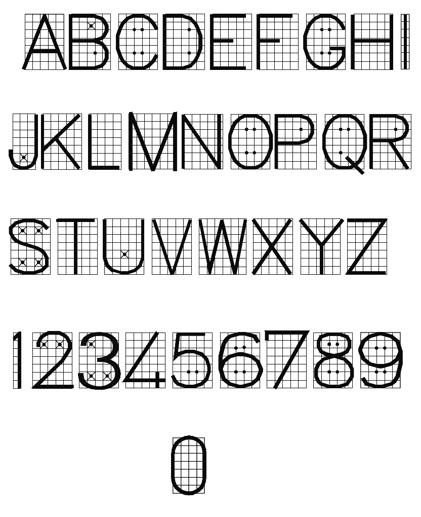
- Single stroke capital letters also known as capital uppercase letters.
- Single stroke capital inclined letters.
- Double stroke capital letters.
- Double stroke inclined capital letters.
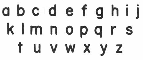
- Small vertical lowercase letters.
- Small inclined lowercase letters.
SINGLE STROKE LETTERS:

Lettering is one of the small things which help to make or mar both the appearance and the usefulness of a drawing, regardless of the quality of the line work. The objective should be to employ uniform letters and figures which will ensure good and legible reproductions from either pen or pencil originals. Simple free hand lettering, perfectly legible and quickly made, is an essential part of modern engineering drawing and it is conventional to print as plainly as possible. Plain wide letters facilitates rapid reading and prevent costly misinterpretations.
The ability to letter correctly involves:
- A perfect knowledge of the forms and proportions of the letters and a study of the directions and order of strokes which compose them.
- Persistent practice in marking the set strokes.
- The development of a high degree of precision in forming and spacing of letters.
Almost anyone can learn to letter if persistent and intelligent in his/her efforts. While it is true that practice makes perfect there must be continuous effort to improve.
Lettering on drawing should be legible, neat in appearance and correct in style. Single stroke letters have these qualifications, therefore, they are universally used for engineering drawings. They should not be executed mechanically but should be made entirely freehand. Letters having all strokes of uniform thickness are classified as Gothic. The style of the letter, when the thickness of the strokes is such that it can be made with single stroke or pencil is called Single Stroke Gothic. The term Single Stroke does not imply that the letter is produced with a continuous movement of the pencil or pen, but that the letter is made of one or more stems or curves, each of which is made of a single stroke.
CAPITAL AND LOWERCASE LETTERS:

These letters may be of two types, Capital and Small or Uppercase and Lowercase. Each of the two types is used in its proper place.
VERTICAL AND SLANT LETTERING:
Further each lettering style may be either vertical or slant.
In vertical lettering stems are perpendicular to the line of lettering.
In slant lettering a slope of 75° to the horizontal is recommended by IS: 696 – 1972.

STANDARD HEIGHT AND WIDTH:
The letters are designated by their height. The stems of lower case letters, such as b, d, h, etc., which extend upward are known Ascenders. The stems of lowercase letters, such as g, j, p, q, y etc., which extend downward, are known as Descenders.
The standard heights recommended by BIS SP: 46-2003 are in the progressive ratio of “square root 2”. They are namely 2.5 – 3.5 – 5 – 7 – 10 – 14 and 20 mm. The height of lower case letter (without tail or stem) are 2.5, 3.5, 5, 7, 10 and 14 mm.
The height of the letters is usually kept as follows:
- Drawing number in title-block and letter denoting cutting plane or section should be 8, 10 or 12 mm.
- Title of drawing should be 6 or 8 mm.
- Sub-title headings should be 3, 4, 5 or 6 mm.
- Notes, such as legends, schedules, materials list, and dimensions should be 3, 4 or 5 mm.
- Alteration entries and the tolerances should be 2 to 3 mm.
There are two standard ratios for the line thickness “d”. They are A & B. In A = line thickness (d) is h/14 and in B=line thickness (d) is h/10.
The width of different letters in terms of “d” is as follows:
CAPITAL LETTER:
| WIDTH (W) | CAPITAL LETTERS | WIDTH |
| 1 | I | 1d |
| 5 | J,L | 5d |
| 6 | C,E,F | 6d |
| 7 | B,D,G,H,K,N,O,P,R,S,T,U & Z | 7d |
| 8 | A,Q,V,X,Y | 8d |
| 9 | M | 9d |
| 12 | W | 12d |
LOWER CASE LETTERS AND NUMERALS:
| WIDTH (W) | LETTERS/NUMERALS | WIDTH |
| 1 | i | 1d |
| 3 | j,l | 3d |
| 4 | f,t,l | 4d |
| 5 | c,r | 5d |
| 6 | a,b,d,e,g,h,k,n,o,p,q,s,u,v;3;5 | 6d |
| 7 | a,0 (zero), 2,4,6,7,8,9 | 7d |
| 9 | m | 9d |
| 10 | w | 10d |
The width of different letters in terms of stroke (line) is as follows:
Uppercase Lettering BIS SP: 46-2003
| WIDTH (W) | CAPITAL LETTERS |
| 1 | I |
| 4 | J |
| 5 | C,E,F,L |
| 6 | B,D,G,H,K,N,O,P,R,S,T,U & Z |
| 7 | A,M,Q,V,X,Y |
| 9 | W |
Lower case letters and numerals
| WIDTH (W) | LETTERS/NUMERALS |
| 1 | i |
| 2 | l |
| 3 | j,l |
| 4 | c,f,r,t |
| 5 | a,b,d,e,g,h,k,n,o,,q,s,u,v,x,y,x,0,2,3,5 to 9 |
| 6 | a,4 |
RELATED VIDEOS FOR LETTERING AND NUMBERING:
